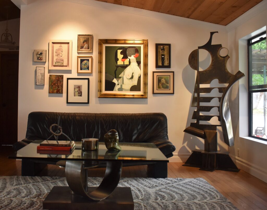
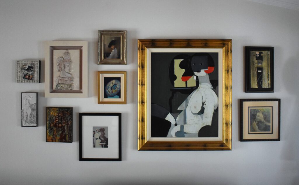
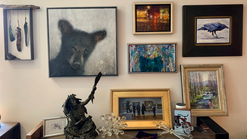
The “Salon Style Hang” can be traced back to 1667 and the beginning of the French Royal Academy salon in Paris. Showcasing work from the academy’s students and masters, the floor-to-ceiling layout highlighted art across an array of genres, styles and mediums, and crowded together selections that both complemented and contrasted one another. Naturally, this created an eye-catching display where even the wall itself could be viewed as a singular art piece—but it wasn’t only about the aesthetics. Salon-style hanging also maximized wall space during the academy’s juried showcases, which were characterized in part by the sheer volume of work on display.
Still popular in modern-day design, the salon-style hang’s seemingly effortless appeal actually requires quite a bit of upfront planning. Spacing, proportions, frame style and composition can make-or-break your look. But, working within a few of these well-defined artistic boundaries can help create a display that’s true to its space and your one-of-a-kind personality.
Picking the perfect wall
Selecting the right wall in your home is the first step. If the defined space is small or oddly shaped, consider filling it entirely with artwork—floor to ceiling and corner-to-corner.

Working with a large surface? Use the salon hang as a focal point. Rather than taking up an entire wall, hanging the cluster of artwork above a couch, headboard or other piece of furniture—and leaving some blank wall space on either end—will create significant dimension without overwhelm.
In both instances, spacing between arrangements doesn’t need to be entirely uniform, but should create a sense of balance when viewed as a whole.
Another best practice is to design your salon wall on the floor before mounting a single piece. Even if you’re planning to grow your display, laying the initial pieces out on the floor will ensure you’re starting with a solid foundation.
Deciding on a color or theme
There is no right or wrong way to design a salon-style wall. It’s all about celebrating your personal aesthetic. Are you a modern minimalist who favors a black and white color scheme? You can still inject some variety with different-sized frames or a diverse display of mediums—from oil on canvas to watercolor and photography prints or even one-of-a-kind commissioned drawings.
Prefer a slightly more eclectic display? Go monochrome. Selecting different shades of the same color emphasizes personality while maintaining a sense of balance. Or, run with a palette of different, but complementary, bold hues. Highlight more earthy tones of red, green or gold. Or display one genre of art in a variety of colors.
Salon-style walls are inherently subjective. Make it the way you see it.

Selecting your frames
Again, this is all about personal preference, but there are a few modern rules of thumb to follow when selecting the frames for your salon-style wall.
First, thin frames in two or three different finishes will create a cleaner, more streamlined look. Ornate gold frames can lend a vintage or historic feel, particularly when paired with portraits or oil landscapes and mounted on a dark-colored wall.
To prevent over-crowding, disperse the thick frames throughout the wall and add balance by filling the space with simpler borders or even unframed pieces. In fact, this hybrid of framed and unframed work is another popular option when designing salon-style walls.

A note on configuration
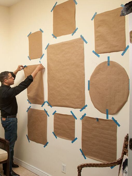
Even if you’ve plotted your exhibit on the ground, you’ll still want to get a sense of how the salon-style hanging will look on the wall. To do this, take a page from a curator’s book and cut pieces of paper in the dimensions of your chosen artwork. Label each piece of paper with the art it represents and then tape them to the wall in the pattern you’ve outlined on the floor.
Take a step back and consider: Does it feel too heavy on one side? Is there too much of one texture in a given area? Does it feel balanced? Are too many large pieces clustered together? Or, is there good geometric consistency? Solving for these issues now will prevent headaches and slip-ups down the road. The paper method is also a great way to build upon existing salon-style walls when introducing fresh pieces.

The bottom line is to have fun with this and make it your own. Yes, it can be complex and it does require some planning, but remember –– it’s your space and it should represent you and bring a smile to your face (and perhaps your other cohabitants!).

